

Results 3,141 to 3,150 of 12096
Thread: Anandtech News
-
07-11-13, 06:30 PM #3141
Anandtech: Some Thoughts About the Lumia 1020 Camera System
Today Nokia announced their new flagship smartphone, the Lumia 1020. I’ve already posted about the announcement and details, and what it really boils down to is that the Lumia 1020 is like a better PureView 808 inside a smaller Lumia 920 chassis. In fact, a quick glance at the About page on the Lumia 1020 shows exactly how much the 1020 is the 808’s spiritual successor – it’s erroneously named the Nokia 909.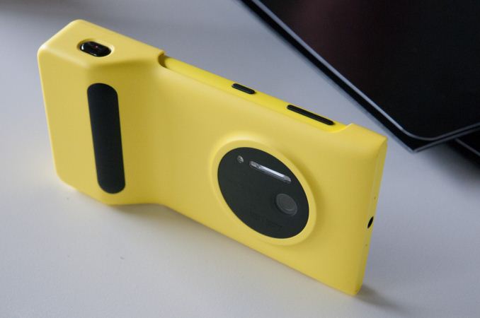 Anyhow I thought it worth writing about the imaging experience on the Lumia 1020 in some detail since that’s the most important part of the device. We’re entering this interesting new era where the best parts of smartphone and camera are coming together into something. I’ve called them connected cameras in the past, but that really only goes as far as describing the ability to use WiFi or 3G, these new devices that also work as phones are something more like a smartphone with further emphasized imaging. Think Galaxy S4 Zoom, PureView 808, and now Lumia 1020. For Nokia the trend isn’t anything new, for the rest of the mobile device landscape to be following suit, is.
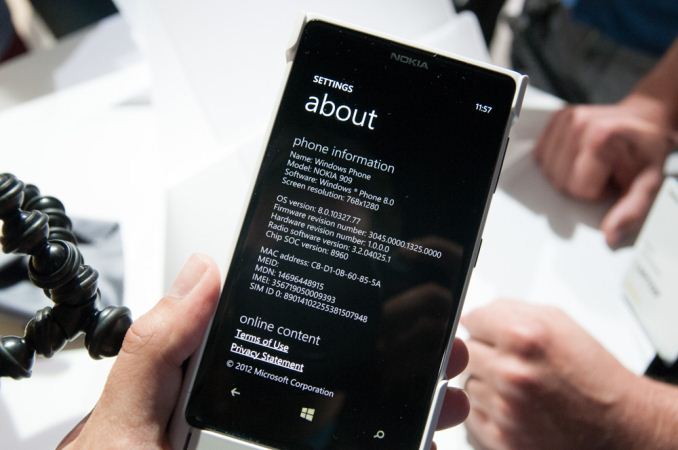
Once again however, Nokia has set a new bar with the Lumia 1020 – it combines the 41 MP oversampling and lossless zoom features from the PureView 808 with Optical Image Stabilization (OIS) and WP8 from the Lumia 920 / 925 / 928 series. And it does so without making the device needlessly bulky, it’s actually thinner and lighter than the Lumia 920. When I heard that Nokia was working on getting the 41 MP profile camera I have to admit I pictured something resembling the PureView 808 with the same relatively large bulge, but just running Windows Phone. The camera region still protrudes, sure, but the extent of the protrusion isn’t nearly as big as that of the 808.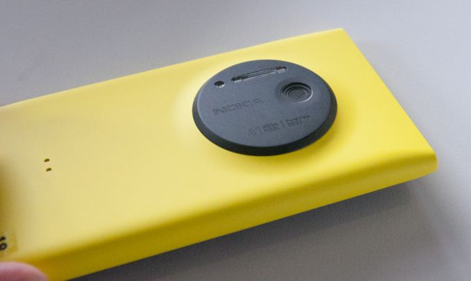
To get that thickness down, Nokia went to 1.12 micron square pixels, as opposed to the 1.4 micron pixels on the PureView 808. This results in a smaller overall sensor (from 1/1.2“ in the 808 to 1/1.5” in the 1020) which in turn lets the optical designers make a thinner system – it’s entirely physics constrained.Camera Emphasized Smartphone Comparison Samsung Galaxy Camera (EK-GC100) Nokia PureView 808 Samsung Galaxy S4 Zoom Nokia Lumia 1020 CMOS Resolution 16.3 MP 41 MP 16.3 MP 41 MP CMOS Format 1/2.3", 1.34µm pixels 1/1.2", 1.4µm pixels 1/2.3", 1.34µm pixels 1/1.5", 1.12µm pixels Lens Details 4.1 - 86mm (22 - 447 35mm equiv)
F/2.8-5.9
OIS8.02mm (28mm 35mm equiv)
F/2.44.3 - 43mm (24-240 mm 35mm equiv)
F/3.1-F/6.3
OISPureView 41 MP, BSI, 6-element optical system, xenon flash, LED, OIS (F/2.2, 25-27mm 35mm eff) Display 1280 x 720 (4.8" diagonal) 640 x 360 (4.0" diagonal) 960 x 540 (4.3-inch) 1280 x 768 (4.5-inch) SoC Exynos 4412 (Cortex-A9MP4 at 1.4 GHz with Mali-400 MP4) 1.3 GHz ARM11 1.5 GHz Exynos 4212 1.5 GHz Snapdragon MSM8960 Storage 8 GB + microSDXC 16 GB + microSDHC 8 GB + microSDHC 32 GB Video Recording 1080p30, 480p120 1080p30 1080p30 1080p30 OS Android 4.1 Symbian Belle Android 4.2 Windows Phone 8 Connectivity WCDMA 21.1 850/900/1900/2100, 4G, 802.11a/b/g/n with 40 MHz channels, BT 4.0, GNSS WCDMA 14.4 850/900/1700/1900/2100, 802.11b/g/n, BT 3.0, GPS WCDMA 21.1 850/900/1900/2100, 4G LTE SKUs, 802.11a/b/g/n with 40 MHz channels, BT 4.0, GNSS Quad band edge, WCDMA 42 850/900/1900/2100
LTE bands 1,3,7,20,8
To make up for the loss of sensitivity, Nokia moved to now-ubiquitous BSI (Back Side Illumination) pixels for the Lumia 1020. I didn’t realize it before, but the 808 used an FSI (Front Side Illumination) sensor. Nokia tells me that the result is the same level of sensitivity between the two at the sensor level, add in OIS and the Lumia 1020 will likely outperform the 808 in low light.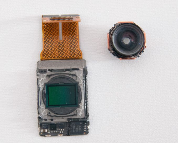
Lumia 1020 CMOS (left), Lens system (right)
At an optical level the Lumia 1020 is equally class-leading. The 1020 moves to an F/2.2 system over the 808’s F/2.4, and is a 6-element system (5 plastic aspheric, 1 glass), with that front objective being entirely glass. Nokia claims to have improved MTF on this new system even more at the edges and resolves enough detail to accommodate those tiny 1.12 micron pixels. Nokia has also moved to a second generation of OIS for the Lumia 1020 – it still is a barrel shift, but instead of pushing the module around with electromagnets, the system now uses very small motors to counteract movements.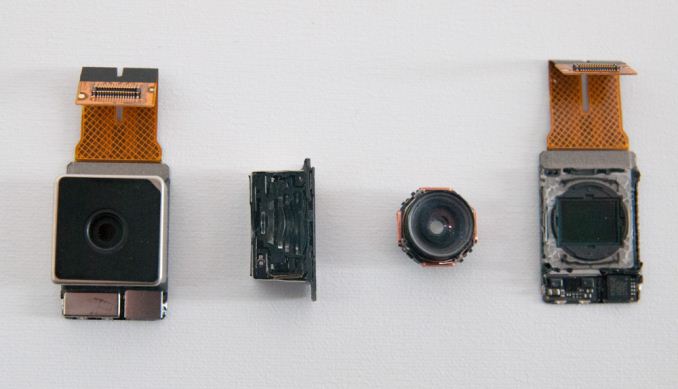
Left to right: Lumia 1020 Module, Module cut in half, lens, CMOS sensor
The Lumia 1020 also has two flashes - an LED for video and AF assist, and xenon for freezing motion and taking stills. Although I still hesitate to use direct flash on any camera, even if it’s xenon and not the hideously blue cast of a white LED, this will help the 1020 push considerably into completely dark territory where you just need some on-camera lighting to get a photo. A lot of the thickness constraints of the 808 I’m told were due to the capacitor for the xenon, the 1020 moves to a flat capacitor.
Nokia laid out the entire optical stack in the open in numerous demos and meetings at their event. The module in the 1020 is big compared even to Nokia’s previous modules. It looks positively gigantic compared to the standard sized commodity modules that come in other phones. The amount of volume that Nokia dedicates to imaging basically tells the story.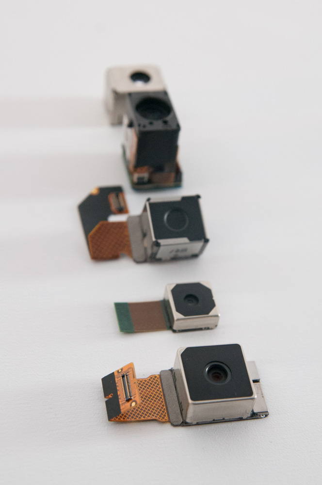
(Bottom to top: Lumia 1020, Lumia 920, PureView 808, N93, ?)
One of my big questions when I heard that 41 MP PureView tech was coming to Windows Phone was what the silicon implementation would look like, since essentially no smartphone SoCs out of box support a 41 MP sensor, certainly none of the ones Windows Phone 8 GDR2 currently supports. With the PureView 808, Nokia used a big dedicated ISP made by Broadcom to do processing. On the Lumia 1020, I was surprised to learn there is no similar dedicated ISP (although my understanding is that it was Nokia’s prerogative to include one), instead Nokia uses MSM8960 silicon for ISP. Obviously the MSM8960 is only specced for up to 20 MP camera support, Nokia’s secret sauce is making this silicon support 41 MP and the PureView features (oversampling, subsampling, lossless on the fly zoom) through collaboration with Qualcomm and rewriting the entire imaging stack themselves. I would not be surprised to learn that parts of this revised imaging solution run on Krait or Hexagon DSP inside 8960 to get around the limitations of its ISP. I suspect the Lumia 1020 includes 2 GB of LPDDR2 partly to accommodate processing those 41 MP images as well. Only with the next revision of Windows Phone (GDR3) will the platform get support for MSM8974 which out of box supports up to 55 MP cameras.
Of course the hardware side is a very interesting one, but the other half of Nokia’s PureView initiative is software features and implementation. With the Lumia 1020, Nokia has done an end-run around the Windows Phone platform by including their own third party camera application called Nokia Pro Cam that leveraging their own APIs built into the platform.
The stock WP8 camera application is still present, it’s just not default (though you can change this under Settings for Photos + Camera). This way Nokia gets the chance to build its own much better camera UI atop Windows Phone.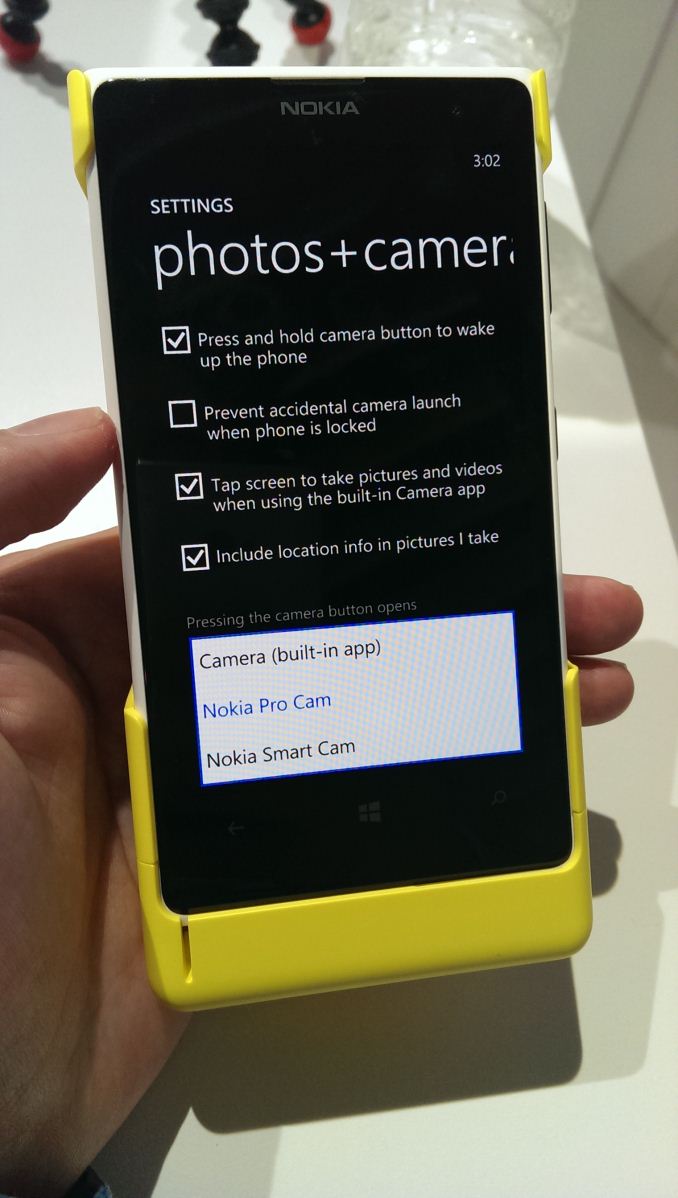
Default camera setting (left), Stock camera still exists (right)
Nokia Pro Cam looks like the most comprehensive mobile camera UI I’ve seen so far. Inside is full control over white balance, manual focus (macro to infinity), ISO (up to 4000), exposure time (up to 4 seconds), and exposure control. While there are other 3rd party camera apps on WP8 that expose some of this, none of them come close to the fluidity of Pro Cam, which adjusts in real time as you change sliders, has a clear reset to defaults gesture, and will highlight potentially hazardous to image quality settings changes with a yellow underline. Of course, you can optionally just leave all of this untouched and run the thing full auto. The best part is that the Lumia 920, 925, and 928 will get this awesome Nokia camera app with the Amber software update.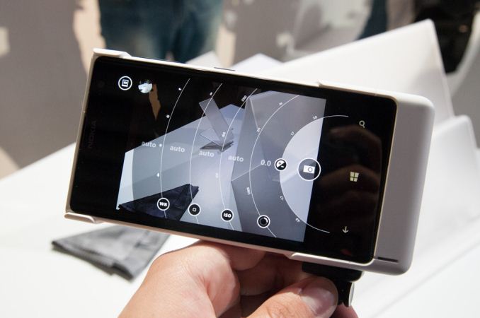
The analogy for the PureView 808 was that it was a 41 MP shooter that took great 5 MP pictures, this remains largely the case with the Lumia 1020 through the use of oversampling. The result is a higher resolution 5 MP image than you’d get out of a 5 MP CMOS with Bayer grid atop it.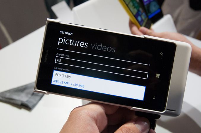
By default, the 1020 stores a 5 MP oversampled copy with the full field of view alongside the full 34 (16:9) or 38 (4:3) MP image. Inside Windows Phone and Pro Cam (Nokia’s camera app) the two look like one image until one zooms in, and of course there’s the ability to of course change this to just store the 5 MP image.
Just like with the PureView 808 there’s also lossless zoom, which steps through progressively smaller subsampled crops of the image sensor until you reach a 1:1 5MP 3x center crop in stills, or 720p 6x crop in video (1080p is 4x). This works just like it did on the PureView 808 with a two finger zoom gesture.
Nokia used to earn a lot of kudos from me for bundling a tripod mount with the PureView 808, with the Lumia 1020 Nokia has gone a different direction by making an optional snap on camera grip and battery. The grip contains a 1020 mAh battery and well done two-stage camera button, and a tripod screw at the bottom. With the camera grip attached, the 1020 felt balanced and like a more stable shooting platform than without.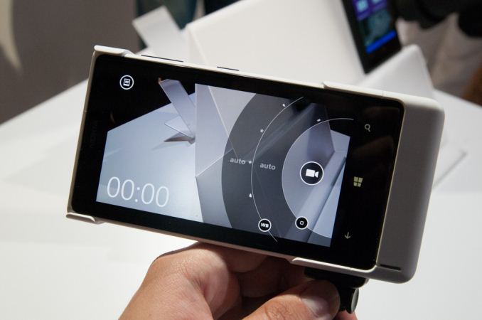
For a full walkthrough of the camera UI and features, I'd encourage you to take a look at the video I shot of Juha Alakarhu going through it, who presented on stage. I also took another video earlier in the day walking through some of it myself. It's really the only way to get an appreciation for how fluid the interface is and how much better it is than the stock WP8 camera app.
Although I wasn’t allowed to pull images from the Lumia 1020 for later review, what I did see on-device was impressive. I think it’s fair to say that once again Nokia has set basically set the bar for the rest of the smartphone imaging world – in terms of both hardware and software features. It's a step forwards from the PureView 808, and from the Lumia 920 / 925 / 928. Of course, the ultimate question is whether consumers are going to appreciate all of it and be willing to pay the premium for the Lumia 1020 over the Lumia 925 / 928 or another smartphone entirely. Although imaging quality is a big emphasis for smartphone shoppers, it isn’t the only one, and the Windows Phone 8 pill is still a big one for me and many others to swallow.
Source: Nokia
Gallery: Some Thoughts About the Lumia 1020 Camera System


More...
-
07-11-13, 08:30 PM #3142
Anandtech: Welcome to the Preview Release of Microsoft 2014
Today Microsoft released a couple of major announcements regarding the restructuring of their entire business. The complete One Microsoft email from Steve Ballmer along with an internal memo entitled Transforming Our Company are available online at Microsoft’s news center, but what does it all really mean? That’s actually a bit difficult to say; clearly times are changing and Microsoft needs to adapt to the new environment, and if we remove all of the buzzwords and business talk, that’s basically what the memo and email are about. Microsoft calls their new strategy the “devices and services chapter” of their business, which gives a clear indication of where they’re heading.
We’ve seen some of this already over the past year or so, in particular the Microsoft Surface and Surface Pro devices are a departure from the way Microsoft has done things in the past – though of course we had other hardware releases like the Xbox, Xbox 360, Zune, etc. We’ve discussed this in some of our reviews as well, where the traditional PC markets are losing ground to smartphones, tablets, and other devices. When companies like Apple and Google are regularly updating their operating systems, in particular iOS and Android, the old model of rolling out a new Windows operating system every several years is no longer sufficient. Depending on other companies for the hardware that properly showcases your platform can also be problematic when one of the most successful companies of the last few years (Apple Computer) controls everything from the top to bottom on their devices.
There’s also the factor of cost; when companies are getting Android OS for free, minus the groundwork required to get it running on your platform, charging $50 or $100 for Windows can be a barrier to adoption. When Microsoft talks about a shift towards devices and services, they are looking for new ways to monetize their business structure. The subscription model for Office 365 is one example of this; rather than owning a copy of office that you can use on one system, you instead pay $100 for the right to use Office 365 on up to five systems for an entire year. This sort of model has worked well for the antivirus companies not to mention subscription gaming services like World of WarCraft, EverQuest, etc., so why not try it for Office? I have to wonder if household subscriptions to Windows are next on the auction block.
One of the other topics that Microsoft gets into with their memo is the need for a consistent user experience across all of the devices people use on a daily basis. Right now, it’s not uncommon for people to have a smartphone, tablet, laptop and/or desktop, a TV set-top box, and maybe even a gaming console or two – and depending on how you are set up, each of those might have a different OS and a different user interface. Some people might not mind switching between the various user interfaces, but this is definitely something that I’ve heard Apple users mention as a benefit: getting a consistent experience across your whole electronic ecosystem. Apple doesn’t get it right in every case either, but I know people that have MacBook laptops, iPads/iPods and iPhones, Apple TV, iTunes, and an AirPort Extreme router, and they are willing to pay more for what they perceive as a better and easier overall experience.
Windows 8 was a step towards that same sort of ecosystem, trying to unify the experience on desktops, laptops, smartphones, tablets, and the Xbox One; some might call it a misstep, but regardless Microsoft is making the effort. “We will strive for a single experience for everything in a person’s life that matters. One experience, one company, one set of learnings, one set of apps, and one personal library of entertainment, photos and information everywhere. One store for everything.” It’s an ambitious goal, and that sort of approach definitely won’t appeal to everyone [thoughts of Big Brother…]; exactly how well Microsoft does in realizing this goal is going to determine how successful this initiative ends up being.
One of the other thoughts I’ve heard increasingly over the past year or two is that while competition is in theory good for the consumer, too much competition can simply result in confusion. The Android smartphone and tablet offerings are good example of this; which version of Android are you running, and which SoC powers your device? There are huge droves of people that could care less about the answer to either question; they just want everything to work properly. I’ve heard some people jokingly (or perhaps not so jokingly) suggest that we would benefit if more than one of the current SoC companies simply “disappeared” – and we could say the same about some of the GPU and CPU vendors that make the cores that go into these SoCs. Again, Microsoft is in a position to help alleviate some of this confusion with their software and devices; whether they can manage to do this better than some of the others that have tried remains to be seen.
However you want to look at things, this is a pretty major attempt at changing the way Microsoft functions. Can actually pull this all off, or is it just so many words? Thankfully, most of us have the easy job of sitting on the sidelines and taking a “wait and see” approach. Steve Ballmer notes, “We have resolved many details of this org, but we still will have more work to do. Undoubtedly, as we involve more people there will be new issues and changes to our current thinking as well. Completing this process will take through the end of the calendar year as we figure things out and as we keep existing teams focused on current deliverables like Windows 8.1, Xbox One, Windows Phone, etc.”
Whatever happens to Microsoft over the coming year or two, these are exciting times for technology enthusiasts. Microsoft has been with us for 37 years now, and clearly they intend to stick around for the next 37 as well. Enjoy the ride!
More...
-
07-11-13, 09:30 PM #3143
Anandtech: Welcome to the Preview Release of Microsoft 2014
Today Microsoft released a couple of major announcements regarding the restructuring of their entire business. The complete One Microsoft email from Steve Ballmer along with an internal memo entitled Transforming Our Company are available online at Microsoft’s news center, but what does it all really mean? That’s actually a bit difficult to say; clearly times are changing and Microsoft needs to adapt to the new environment, and if we remove all of the buzzwords and business talk, that’s basically what the memo and email are about. Microsoft calls their new strategy the “devices and services chapter” of their business, which gives a clear indication of where they’re heading.
We’ve seen some of this already over the past year or so, in particular the Microsoft Surface and Surface Pro devices are a departure from the way Microsoft has done things in the past – though of course we had other hardware releases like the Xbox, Xbox 360, Zune, etc. We’ve discussed this in some of our reviews as well, where the traditional PC markets are losing ground to smartphones, tablets, and other devices. When companies like Apple and Google are regularly updating their operating systems, in particular iOS and Android, the old model of rolling out a new Windows operating system every several years is no longer sufficient. Depending on other companies for the hardware that properly showcases your platform can also be problematic when one of the most successful companies of the last few years (Apple Computer) controls everything from the top to bottom on their devices.
There’s also the factor of cost; when companies are getting Android OS for free, minus the groundwork required to get it running on your platform, charging $50 or $100 for Windows can be a barrier to adoption. When Microsoft talks about a shift towards devices and services, they are looking for new ways to monetize their business structure. The subscription model for Office 365 is one example of this; rather than owning a copy of office that you can use on one system, you instead pay $100 for the right to use Office 365 on up to five systems for an entire year. This sort of model has worked well for the antivirus companies not to mention subscription gaming services like World of WarCraft, EverQuest, etc., so why not try it for Office? I have to wonder if household subscriptions to Windows are next on the auction block.
One of the other topics that Microsoft gets into with their memo is the need for a consistent user experience across all of the devices people use on a daily basis. Right now, it’s not uncommon for people to have a smartphone, tablet, laptop and/or desktop, a TV set-top box, and maybe even a gaming console or two – and depending on how you are set up, each of those might have a different OS and a different user interface. Some people might not mind switching between the various user interfaces, but this is definitely something that I’ve heard Apple users mention as a benefit: getting a consistent experience across your whole electronic ecosystem. Apple doesn’t get it right in every case either, but I know people that have MacBook laptops, iPads/iPods and iPhones, Apple TV, iTunes, and an AirPort Extreme router, and they are willing to pay more for what they perceive as a better and easier overall experience.
Windows 8 was a step towards that same sort of ecosystem, trying to unify the experience on desktops, laptops, smartphones, tablets, and the Xbox One; some might call it a misstep, but regardless Microsoft is making the effort. “We will strive for a single experience for everything in a person’s life that matters. One experience, one company, one set of learnings, one set of apps, and one personal library of entertainment, photos and information everywhere. One store for everything.” It’s an ambitious goal, and that sort of approach definitely won’t appeal to everyone [thoughts of Big Brother…]; exactly how well Microsoft does in realizing this goal is going to determine how successful this initiative ends up being.
One of the other thoughts I’ve heard increasingly over the past year or two is that while competition is in theory good for the consumer, too much competition can simply result in confusion. The Android smartphone and tablet offerings are good example of this; which version of Android are you running, and which SoC powers your device? There are huge droves of people that couldn't care less about the answer to either question; they just want everything to work properly. I’ve heard some people jokingly (or perhaps not so jokingly) suggest that we would benefit if more than one of the current SoC companies simply “disappeared” – and we could say the same about some of the GPU and CPU vendors that make the cores that go into these SoCs. Again, Microsoft is in a position to help alleviate some of this confusion with their software and devices; whether they can manage to do this better than some of the others that have tried remains to be seen.
However you want to look at things, this is a pretty major attempt at changing the way Microsoft functions. Can actually pull this all off, or is it just so many words? Thankfully, most of us have the easy job of sitting on the sidelines and taking a “wait and see” approach. Steve Ballmer notes, “We have resolved many details of this org, but we still will have more work to do. Undoubtedly, as we involve more people there will be new issues and changes to our current thinking as well. Completing this process will take through the end of the calendar year as we figure things out and as we keep existing teams focused on current deliverables like Windows 8.1, Xbox One, Windows Phone, etc.”
Whatever happens to Microsoft over the coming year or two, these are exciting times for technology enthusiasts. Microsoft has been with us for 37 years now, and clearly they intend to stick around for the next 37 as well. Enjoy the ride!
More...
-
07-13-13, 02:00 PM #3144
Anandtech: ASUS PQ321Q First Look
Beyond monitor reviews for AnandTech, I do reviews of TVs and Projectors for a number of sites. Ever since Sony launched their VPL-HW1000 4K projector at CEDIA in 2011, the idea of 4K, or Ultra High Definition (UHD), in the home has been picking up speed. Unfortunately I think for the home theater world this has as much to do with 3D not making vendors much of a profit, and OLED being continually delayed, and needing to have some technology to fill in a gap that provides a source of revenue. Flat panels keep falling in price and vendors keep needing to find a way to get consumers to upgrade to something better to make money.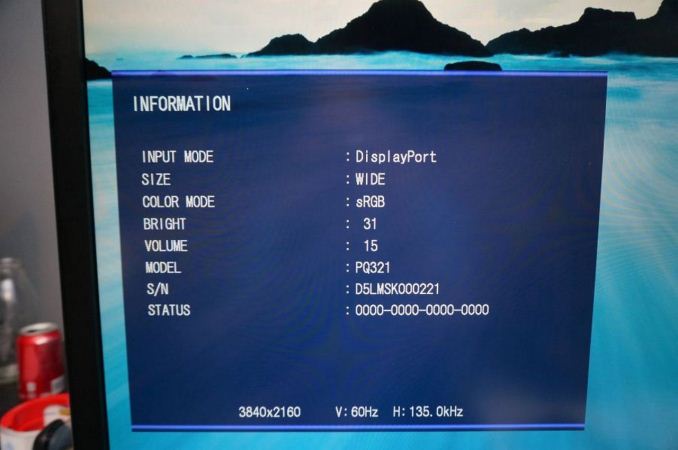

When it comes to computers, smartphones, and tablets, these benefits totally change. There is native high-resolution content available, and we sit much closer to our 32" desktop monitors relative to how close we are to a 50" flat screen TV. As a result we were all excited to see the ASUS PQ321Q be announced in June and have been waiting for a review sample to arrive. It did this week and while the full review will be coming as soon as possible, this is a quick look at the performance out of the box, and how it works.
Gallery: ASUS PQ321Q Exterior and OSD


Sitting next to a 30", 2560x1600 display, the ASUS (on the left) looks around the same size. It has a nice, thin design that looks good on the desk, but necessitates a large power brick to accomplish. It feels very solid, as you expect from a display that costs $3,500, and has a slight anti-glare finish applied to it. The amount seems to be quite low, as I don't see any fogginess or sparkles or other issues on the screen. I'm not sure if it is a design decision, or something that will be changed down the road, but currently the labels to control the OSD are on the back of the display and not the front. ASUS includes a sticker if you want to have them on the front (which I attached), but if you are only going to use them to initially calibrate the monitor then you'll have a nice, clean front without it on.
For my testing I also installed the preview copy of Windows 8.1 to use DPI scaling. At 100% text on the ASUS is very small and hard to read. Setting it to 150% and now on applications that support it, it looks very sharp. Images and screenshots look amazing, but typing this in Chrome right now it looks fuzzy. This is going to be an issue with Windows and HighDPI displays until every vendor manages to update their software to support resolution scaling better. Viewing webpages in Firefox they are crisp and sharp compared to Chrome, so software vendors really need to catch up.
Using an NVIDIA GTX 660 Ti card, with the most recent drivers, you can enable MST mode on the ASUS to provide a full 3840x2160 signal at 60p over a single DisplayPort cable. I know with some earlier UHD monitors I had heard this could be an issue and you would be limited to 30p, but on the ASUS it worked great as soon as I changed the menu setting.
For some initial testing, I used CalMAN 5.1.2 and the sRGB mode on the ASUS PQ321Q. All measurements were done as they are with other monitor reviews, using a profiled C6 meter and targeting 200 nits of light output and a gamma of 2.2.

 Looking at these charts for the grayscale, we see that the overall error starts low but rises up to a dE2000 over 3.0 by the end. There is a lack of blue at the top end, and that leads us to a warmer that reference CCT of 6279 on average. The gamma tracks pretty well, with an overall average of 2.14, and the average grayscale dE2000 is only 1.99 in the end. The largest issue with this test was getting the brightness level correct. There are only 31 steps of brightness control, so I wound up with a white level of 204 nits instead of the target 200 nits. Very close, but that is a pretty coarse adjustment.
Testing maximum and minimum brightness levels for white level, black level, and contrast provided the following data.
We have a huge range in brightness, from 57 nits up to 408 nits, and a small level of control over it. If you are trying to target a number like 200 exactly, you will be slightly off, but you can get pretty close. It's just surprising to see such small control for such a huge range.Maximum Backlight Minimum Backlight White Level 408 nits 57 nits Black Level 0.5326 nits 0.0756 nits Contrast Ratio 766:1 755:1
With colors, the ASUS PQ321Q isn't quite as good as with the grayscale. The main issue looks to be a lack of red and blue saturation, which causes a lack of magenta saturation as well. Looking at the CIE chart you see those points fall short of their targets. You'll also see that green goes a bit too far, giving us some color errors that are over 3.0 except for Cyan.
 On the more strenuous Gretag Macbeth testing, SpectraCal has added a 96-point test that goes above and beyond the 24-point test we have always run. The average dE2000 I found with the two version were 2.61 and 2.65, so they produce very comparable results. I will use the 96-point version going forward as it provides a larger number of data points, and if one sample is bad and 95 are good, will produce an average value that better indicates that. For smartphones and tablets we will continue to use 24-point versions, as those tests are not automated like the PC versions are.

 As we saw with the standard color CIE chart, reds and oranges are the worst offenders, as they are a bit out of the gamut but lacking in saturation on the red end. Cyans, Magentas and greens are better, but the overall color reproduction isn't perfect straight out of the box.
Our final initial test is the saturation test. As you might expect with a gamut where under-saturation is an issue, the errors get larger as saturation approaches 100%.
 This is a fast look at the ASUS PQ321Q. The full AnandTech review will follow shortly as I push it through its paces to see what it can do. Any additional features that people want to see tested you can let me know in the comments and I will try my best to accomplish them.
More...
-
07-13-13, 08:30 PM #3145
Anandtech: Samsung Galaxy S 4 Qi Wireless Charging Pad and Cover - Mini Review
For a while now, wireless charging has been slowly gaining momentum, and one of the phones that includes support is Samsung’s Galaxy S 4 (SGS4). For the past week, I’ve been using Samsung’s wireless charging accessory kit for the aforementioned smartphone which includes both a Qi compatible wireless charging pad and battery back.
Using the wireless charging accessory is simple – you remove the stock battery back, snap on the new one, and plug the wireless charging pad into the Samsung charger that originally shipped with the phone. This last point is critical, as the wireless charging pad requires the 2 amp charger that Samsung supplies with the SGS4. I’ve touched on charging in the past before, but this charger includes the 1.2 V signaling across the D+ and D- pins which signals 2 amp (tablet-class) compatible charging to Samsung devices, like the charging pad. Using a normal BC 1.2 compatible charger won’t work, as that specification only stipulates up to 1.5 amp delivery on its dedicated charging port.
Of course, since the charging pad and SGS4 are Qi compliant, you can obviously use a variety of wireless charging pads that implement that standard to charge the device. I tested on my go-to Energizer dual position Qi charger, and the SGS4 with wireless charging back worked as expected.
The only downside with the wireless charging back is that it does add noticeably to the thickness of the SGS4. I broke out my calipers and measured an increase in thickness of just over 1.7 mm with the wireless charging back attached instead of the stock one.
It’s not a huge difference, but it is noticeable. I suppose one benefit to this added thickness is that the front vertex of the camera no longer is the thickest part of the SGS4, which adds a bit of protection if you’re laying it back-first, on a flat surface.Samsung Galaxy S 4 Charging Back Thickness (Measured) SGS4 No Battery Cover 7.20 mm SGS4 Stock Battery Cover 7.94 mm SGS4 Wireless Charging Battery Cover 9.70 mm
The back of the wireless charging back has two sets of two contact pads that mate up with the inside of the SGS4. I tested with my DMM and on one set you get a steady 5 volts when aligned with the charging pad, on the other nothing. I strongly suspect the wireless charging downstream controller is in this battery back, so Samsung can keep their handsets relatively standards-agnostic and just ship whatever wireless charging standard back they want. In addition this obviously would help keep the BOM cost lower on the device and avoids shipping controllers that customers might not use.
So the big last question is – how well does it work and how fast does it charge the SGS4? For a while now I’ve been measuring charge times for devices, something I believe enters just as strongly into the battery and power side of a device as its time through our battery life tests. The SGS4 is already one of the fastest charging devices out there considering its battery size thanks to the speedy (albeit proprietary) 2 amp charging signaling. Because there’s overhead involved with wireless charging, this obviously gets diminished with the wireless charger. I measured a fully drained to fully charged time of 3.922 hours with the wireless charging back attached and Samsung’s charging pad connected to the 2 amp charger.
That’s a measurable and obvious increase in time over the dedicated 2 amp charger connected over USB (2.883 hours, so about 35 percent longer charge time), but that’s the price you pay for the added convenience of not having to plug anything in. On the device side wireless charging is implemented properly, you see the wireless charging splash screen while charging you see the wireless charging logo with the device off, and wireless charging indicators in Android.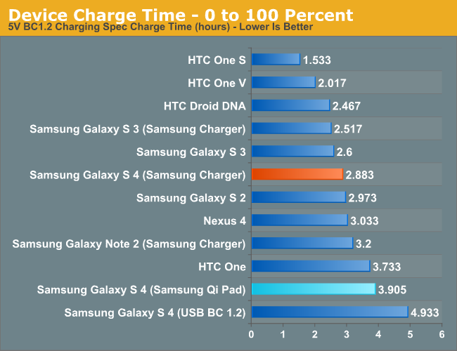
As I mentioned earlier, wireless charging is slowly gaining momentum. It isn’t everywhere, but it’s starting to become more and more of a given instead of a one-off. I’m still waiting for my Qi-compliant nightstand table from IKEA, or charging pads at my local cafe, but who knows when that’ll finally (if ever) happen. Obviously uptake for Samsung would be faster were the SGS4 compatible without the need for an accessory back and charging pad, but the tradeoff would obviously be a thicker phone. I’m pleased with the wireless charging accessory, it works like it’s supposed to, and wireless charging definitely is an added convenience after you’ve used it for a while. The wireless charging pad from Samsung runs for $49, and the wireless charging cover runs $39, both of which are a little steep but still around what I would expect for the pad. Of course the nice thing about Qi is that after you have the cover, you can always shop around for a pad that suits you.
Gallery: Galaxy S 4 Wireless Charging Kit


Source: Samsung (Wireless Charging Pad) (Wireless Charging Cover)
More...
-
07-13-13, 10:30 PM #3146
Anandtech: Samsung Galaxy S 4 Qi Wireless Charging Pad and Cover - Mini Review
For a while now, wireless charging has been slowly gaining momentum, and one of the phones that includes support is Samsung’s Galaxy S 4 (SGS4). For the past week, I’ve been using a review unit of Samsung’s wireless charging accessory kit for the aforementioned smartphone which includes both a Qi compatible wireless charging pad and battery back.
Using the wireless charging accessory is simple – you remove the stock battery back, snap on the new one, and plug the wireless charging pad into the Samsung charger that originally shipped with the phone. This last point is critical, as the wireless charging pad requires the 2 amp charger that Samsung supplies with the SGS4. I’ve touched on charging in the past before, but this charger includes the 1.2 V signaling across the D+ and D- pins which signals 2 amp (tablet-class) compatible charging to Samsung devices, like the charging pad. Using a normal BC 1.2 compatible charger won’t work, as that specification only stipulates up to 1.5 amp delivery on its dedicated charging port.
Of course, since the charging pad and SGS4 are Qi compliant, you can obviously use a variety of wireless charging pads that implement that standard to charge the device. I tested on my go-to Energizer dual position Qi charger, and the SGS4 with wireless charging back worked as expected.
The only downside with the wireless charging back is that it does add noticeably to the thickness of the SGS4. I broke out my calipers and measured an increase in thickness of just over 1.7 mm with the wireless charging back attached instead of the stock one.
It’s not a huge difference, but it is noticeable. I suppose one benefit to this added thickness is that the front vertex of the camera no longer is the thickest part of the SGS4, which adds a bit of protection if you’re laying it back-first, on a flat surface.Samsung Galaxy S 4 Charging Back Thickness (Measured) SGS4 No Battery Cover 7.20 mm SGS4 Stock Battery Cover 7.94 mm SGS4 Wireless Charging Battery Cover 9.70 mm
The back of the wireless charging back has two sets of two contact pads that mate up with the inside of the SGS4. I tested with my DMM and on one set you get a steady 5 volts when aligned with the charging pad, on the other nothing. I strongly suspect the wireless charging downstream controller is in this battery back, so Samsung can keep their handsets relatively standards-agnostic and just ship whatever wireless charging standard back they want. In addition this obviously would help keep the BOM cost lower on the device and avoids shipping controllers that customers might not use.
So the big last question is – how well does it work and how fast does it charge the SGS4? For a while now I’ve been measuring charge times for devices, something I believe enters just as strongly into the battery and power side of a device as its time through our battery life tests. The SGS4 is already one of the fastest charging devices out there considering its battery size thanks to the speedy (albeit proprietary) 2 amp charging signaling. Because there’s overhead involved with wireless charging, this obviously gets diminished with the wireless charger. I measured a fully drained to fully charged time of 3.922 hours with the wireless charging back attached and Samsung’s charging pad connected to the 2 amp charger.
That’s a measurable and obvious increase in time over the dedicated 2 amp charger connected over USB (2.883 hours, so about 35 percent longer charge time), but that’s the price you pay for the added convenience of not having to plug anything in. On the device side wireless charging is implemented properly, you see the wireless charging splash screen while charging you see the wireless charging logo with the device off, and wireless charging indicators in Android.
As I mentioned earlier, wireless charging is slowly gaining momentum. It isn’t everywhere, but it’s starting to become more and more of a given instead of a one-off. I’m still waiting for my Qi-compliant nightstand table from IKEA, or charging pads at my local cafe, but who knows when that’ll finally (if ever) happen. Obviously uptake for Samsung would be faster were the SGS4 compatible without the need for an accessory back and charging pad, but the tradeoff would obviously be a thicker phone. I’m pleased with the wireless charging accessory, it works like it’s supposed to, and wireless charging definitely is an added convenience after you’ve used it for a while. The wireless charging pad from Samsung runs for $49, and the wireless charging cover runs $39, both of which are a little steep but still around what I would expect for the pad. Of course the nice thing about Qi is that after you have the cover, you can always shop around for a pad that suits you.
Gallery: Galaxy S 4 Wireless Charging Kit
Source: Samsung (Wireless Charging Pad) (Wireless Charging Cover)
More...
-
07-14-13, 12:30 AM #3147
Anandtech: ASUS PQ321Q First Look
Beyond monitor reviews for AnandTech, I do reviews of TVs and Projectors for a number of sites. Ever since Sony launched their VPL-HW1000 4K projector at CEDIA in 2011, the idea of 4K, or Ultra High Definition (UHD), in the home has been picking up speed. Unfortunately I think for the home theater world this has as much to do with 3D not making vendors much of a profit, and OLED being continually delayed, and needing to have some technology to fill in a gap that provides a source of revenue. Flat panels keep falling in price and vendors keep needing to find a way to get consumers to upgrade to something better to make money.When it comes to computers, smartphones, and tablets, these benefits totally change. There is native high-resolution content available, and we sit much closer to our 32" desktop monitors relative to how close we are to a 50" flat screen TV. As a result we were all excited to see the ASUS PQ321Q be announced in June and have been waiting for a review sample to arrive. It did this week and while the full review will be coming as soon as possible, this is a quick look at the performance out of the box, and how it works.
Gallery: ASUS PQ321Q Exterior and OSD
Sitting next to a 30", 2560x1600 display, the ASUS (on the left) looks around the same size. It has a nice, thin design that looks good on the desk, but necessitates a large power brick to accomplish. It feels very solid, as you expect from a display that costs $3,500, and has a slight anti-glare finish applied to it. The amount seems to be quite low, as I don't see any fogginess or sparkles or other issues on the screen. I'm not sure if it is a design decision, or something that will be changed down the road, but currently the labels to control the OSD are on the back of the display and not the front. ASUS includes a sticker if you want to have them on the front (which I attached), but if you are only going to use them to initially calibrate the monitor then you'll have a nice, clean front without it on.
For my testing I also installed the preview copy of Windows 8.1 to use DPI scaling. At 100% text on the ASUS is very small and hard to read. Setting it to 150% and now on applications that support it, it looks very sharp. Images and screenshots look amazing, but typing this in Chrome right now it looks fuzzy. This is going to be an issue with Windows and HighDPI displays until every vendor manages to update their software to support resolution scaling better. Viewing webpages in Firefox they are crisp and sharp compared to Chrome, so software vendors really need to catch up.
Using an NVIDIA GTX 660 Ti card, with the most recent drivers, you can enable MST mode on the ASUS to provide a full 3840x2160 signal at 60p over a single DisplayPort cable. I know with some earlier UHD monitors I had heard this could be an issue and you would be limited to 30p, but on the ASUS it worked great as soon as I changed the menu setting.
For some initial testing, I used CalMAN 5.1.2 and the sRGB mode on the ASUS PQ321Q. All measurements were done as they are with other monitor reviews, using a profiled C6 meter and targeting 200 nits of light output and a gamma of 2.2.
Looking at these charts for the grayscale, we see that the overall error starts low but rises up to a dE2000 over 3.0 by the end. There is a lack of blue at the top end, and that leads us to a warmer that reference CCT of 6279 on average. The gamma tracks pretty well, with an overall average of 2.14, and the average grayscale dE2000 is only 1.99 in the end. The largest issue with this test was getting the brightness level correct. There are only 31 steps of brightness control, so I wound up with a white level of 204 nits instead of the target 200 nits. Very close, but that is a pretty coarse adjustment.
Testing maximum and minimum brightness levels for white level, black level, and contrast provided the following data.
We have a huge range in brightness, from 57 nits up to 408 nits, and a small level of control over it. If you are trying to target a number like 200 exactly, you will be slightly off, but you can get pretty close. It's just surprising to see such small control for such a huge range.Maximum Backlight Minimum Backlight White Level 408 nits 57 nits Black Level 0.5326 nits 0.0756 nits Contrast Ratio 766:1 755:1
With colors, the ASUS PQ321Q isn't quite as good as with the grayscale. The main issue looks to be a lack of red and blue saturation, which causes a lack of magenta saturation as well. Looking at the CIE chart you see those points fall short of their targets. You'll also see that green goes a bit too far, giving us some color errors that are over 3.0 except for Cyan.
On the more strenuous Gretag Macbeth testing, SpectraCal has added a 96-point test that goes above and beyond the 24-point test we have always run. The average dE2000 I found with the two version were 2.61 and 2.65, so they produce very comparable results. I will use the 96-point version going forward as it provides a larger number of data points, and if one sample is bad and 95 are good, will produce an average value that better indicates that. For smartphones and tablets we will continue to use 24-point versions, as those tests are not automated like the PC versions are.
As we saw with the standard color CIE chart, reds and oranges are the worst offenders, as they are a bit out of the gamut but lacking in saturation on the red end. Cyans, Magentas and greens are better, but the overall color reproduction isn't perfect straight out of the box.
Our final initial test is the saturation test. As you might expect with a gamut where under-saturation is an issue, the errors get larger as saturation approaches 100%.
This is a fast look at the ASUS PQ321Q. The full AnandTech review will follow shortly as I push it through its paces to see what it can do. Any additional features that people want to see tested you can let me know in the comments and I will try my best to accomplish them.
More...
-
07-15-13, 09:01 AM #3148
Anandtech: Introducing AnandTech Mobile: A Responsive Design Update
For the past couple of months our ad sales team has been engaged with Box, an enterprise file sharing and cloud content management company. Box was looking for a way to increase its exposure and brand awareness, and we had a platform to do just that. Rather than rely on typical advertising, Box was thinking of something a little more, er, outside of the box.
Box is absolutely amazing to work with. Rather than asking what we could do for them, they asked us what they could do for us. What immediately came to mind was the overwhelming number of requests for a responsive version of AnandTech. We presented the idea of sponsoring the design and creation of AnandTech Mobile to Box, and they loved it. Over the past month we've been modifying AnandTech and preparing the first responsive implementation of the site. Today, AnandTech Mobile is live.
More...
-
07-15-13, 09:01 AM #3149
Anandtech: Samsung Galaxy S 4 Qi Wireless Charging Pad and Cover - Mini Review
For a while now, wireless charging has been slowly gaining momentum, and one of the phones that includes support is Samsung’s Galaxy S 4 (SGS4). For the past week, I’ve been using a review unit of Samsung’s wireless charging accessory kit for the aforementioned smartphone which includes both a Qi compatible wireless charging pad and battery back.
Using the wireless charging accessory is simple – you remove the stock battery back, snap on the new one, and plug the wireless charging pad into the Samsung charger that originally shipped with the phone. This last point is critical, as the wireless charging pad requires the 2 amp charger that Samsung supplies with the SGS4. I’ve touched on charging in the past before, but this charger includes the 1.2 V signaling across the D+ and D- pins which signals 2 amp (tablet-class) compatible charging to Samsung devices, like the charging pad. Using a normal BC 1.2 compatible charger won’t work, as that specification only stipulates up to 1.5 amp delivery on its dedicated charging port.
Of course, since the charging pad and SGS4 are Qi compliant, you can obviously use a variety of wireless charging pads that implement that standard to charge the device. I tested on my go-to Energizer dual position Qi charger, and the SGS4 with wireless charging back worked as expected.
The only downside with the wireless charging back is that it does add noticeably to the thickness of the SGS4. I broke out my calipers and measured an increase in thickness of just over 1.7 mm with the wireless charging back attached instead of the stock one.
It’s not a huge difference, but it is noticeable. I suppose one benefit to this added thickness is that the front vertex of the camera no longer is the thickest part of the SGS4, which adds a bit of protection if you’re laying it back-first, on a flat surface.Samsung Galaxy S 4 Charging Back Thickness (Measured) SGS4 No Battery Cover 7.20 mm SGS4 Stock Battery Cover 7.94 mm SGS4 Wireless Charging Battery Cover 9.70 mm
The back of the wireless charging back has two sets of two contact pads that mate up with the inside of the SGS4. I tested with my DMM and on one set you get a steady 5 volts when aligned with the charging pad, on the other nothing. I strongly suspect the wireless charging downstream controller is in this battery back, so Samsung can keep their handsets relatively standards-agnostic and just ship whatever wireless charging standard back they want. In addition this obviously would help keep the BOM cost lower on the device and avoids shipping controllers that customers might not use.
So the big last question is – how well does it work and how fast does it charge the SGS4? For a while now I’ve been measuring charge times for devices, something I believe enters just as strongly into the battery and power side of a device as its time through our battery life tests. The SGS4 is already one of the fastest charging devices out there considering its battery size thanks to the speedy (albeit proprietary) 2 amp charging signaling. Because there’s overhead involved with wireless charging, this obviously gets diminished with the wireless charger. I measured a fully drained to fully charged time of 3.922 hours with the wireless charging back attached and Samsung’s charging pad connected to the 2 amp charger.
That’s a measurable and obvious increase in time over the dedicated 2 amp charger connected over USB (2.883 hours, so about 35 percent longer charge time), but that’s the price you pay for the added convenience of not having to plug anything in. On the device side wireless charging is implemented properly, you see the wireless charging splash screen while charging you see the wireless charging logo with the device off, and wireless charging indicators in Android.
As I mentioned earlier, wireless charging is slowly gaining momentum. It isn’t everywhere, but it’s starting to become more and more of a given instead of a one-off. I’m still waiting for my Qi-compliant nightstand table from IKEA, or charging pads at my local cafe, but who knows when that’ll finally (if ever) happen. Obviously uptake for Samsung would be faster were the SGS4 compatible without the need for an accessory back and charging pad, but the tradeoff would obviously be a thicker phone. I’m pleased with the wireless charging accessory, it works like it’s supposed to, and wireless charging definitely is an added convenience after you’ve used it for a while. The wireless charging pad from Samsung runs for $49, and the wireless charging cover runs $39, both of which are a little steep but still around what I would expect for the pad. Of course the nice thing about Qi is that after you have the cover, you can always shop around for a pad that suits you.
Gallery: Galaxy S 4 Wireless Charging Kit
Source: Samsung (Wireless Charging Pad) (Wireless Charging Cover)
More...
-
07-15-13, 09:01 AM #3150
Anandtech: ASUS PQ321Q First Look
Beyond monitor reviews for AnandTech, I do reviews of TVs and Projectors for a number of sites. Ever since Sony launched their VPL-HW1000 4K projector at CEDIA in 2011, the idea of 4K, or Ultra High Definition (UHD), in the home has been picking up speed. Unfortunately I think for the home theater world this has as much to do with 3D not making vendors much of a profit, and OLED being continually delayed, and needing to have some technology to fill in a gap that provides a source of revenue. Flat panels keep falling in price and vendors keep needing to find a way to get consumers to upgrade to something better to make money.When it comes to computers, smartphones, and tablets, these benefits totally change. There is native high-resolution content available, and we sit much closer to our 32" desktop monitors relative to how close we are to a 50" flat screen TV. As a result we were all excited to see the ASUS PQ321Q be announced in June and have been waiting for a review sample to arrive. It did this week and while the full review will be coming as soon as possible, this is a quick look at the performance out of the box, and how it works.
Gallery: ASUS PQ321Q Exterior and OSD
Sitting next to a 30", 2560x1600 display, the ASUS (on the left) looks around the same size. It has a nice, thin design that looks good on the desk, but necessitates a large power brick to accomplish. It feels very solid, as you expect from a display that costs $3,500, and has a slight anti-glare finish applied to it. The amount seems to be quite low, as I don't see any fogginess or sparkles or other issues on the screen. I'm not sure if it is a design decision, or something that will be changed down the road, but currently the labels to control the OSD are on the back of the display and not the front. ASUS includes a sticker if you want to have them on the front (which I attached), but if you are only going to use them to initially calibrate the monitor then you'll have a nice, clean front without it on.
For my testing I also installed the preview copy of Windows 8.1 to use DPI scaling. At 100% text on the ASUS is very small and hard to read. Setting it to 150% and now on applications that support it, it looks very sharp. Images and screenshots look amazing, but typing this in Chrome right now it looks fuzzy. This is going to be an issue with Windows and HighDPI displays until every vendor manages to update their software to support resolution scaling better. Viewing webpages in Firefox they are crisp and sharp compared to Chrome, so software vendors really need to catch up.
Using an NVIDIA GTX 660 Ti card, with the most recent drivers, you can enable MST mode on the ASUS to provide a full 3840x2160 signal at 60p over a single DisplayPort cable. I know with some earlier UHD monitors I had heard this could be an issue and you would be limited to 30p, but on the ASUS it worked great as soon as I changed the menu setting.
For some initial testing, I used CalMAN 5.1.2 and the sRGB mode on the ASUS PQ321Q. All measurements were done as they are with other monitor reviews, using a profiled C6 meter and targeting 200 nits of light output and a gamma of 2.2.
Looking at these charts for the grayscale, we see that the overall error starts low but rises up to a dE2000 over 3.0 by the end. There is a lack of blue at the top end, and that leads us to a warmer that reference CCT of 6279 on average. The gamma tracks pretty well, with an overall average of 2.14, and the average grayscale dE2000 is only 1.99 in the end. The largest issue with this test was getting the brightness level correct. There are only 31 steps of brightness control, so I wound up with a white level of 204 nits instead of the target 200 nits. Very close, but that is a pretty coarse adjustment.
Testing maximum and minimum brightness levels for white level, black level, and contrast provided the following data.
We have a huge range in brightness, from 57 nits up to 408 nits, and a small level of control over it. If you are trying to target a number like 200 exactly, you will be slightly off, but you can get pretty close. It's just surprising to see such small control for such a huge range.Maximum Backlight Minimum Backlight White Level 408 nits 57 nits Black Level 0.5326 nits 0.0756 nits Contrast Ratio 766:1 755:1
With colors, the ASUS PQ321Q isn't quite as good as with the grayscale. The main issue looks to be a lack of red and blue saturation, which causes a lack of magenta saturation as well. Looking at the CIE chart you see those points fall short of their targets. You'll also see that green goes a bit too far, giving us some color errors that are over 3.0 except for Cyan.
On the more strenuous Gretag Macbeth testing, SpectraCal has added a 96-point test that goes above and beyond the 24-point test we have always run. The average dE2000 I found with the two version were 2.61 and 2.65, so they produce very comparable results. I will use the 96-point version going forward as it provides a larger number of data points, and if one sample is bad and 95 are good, will produce an average value that better indicates that. For smartphones and tablets we will continue to use 24-point versions, as those tests are not automated like the PC versions are.
As we saw with the standard color CIE chart, reds and oranges are the worst offenders, as they are a bit out of the gamut but lacking in saturation on the red end. Cyans, Magentas and greens are better, but the overall color reproduction isn't perfect straight out of the box.
Our final initial test is the saturation test. As you might expect with a gamut where under-saturation is an issue, the errors get larger as saturation approaches 100%.
This is a fast look at the ASUS PQ321Q. The full AnandTech review will follow shortly as I push it through its paces to see what it can do. Any additional features that people want to see tested you can let me know in the comments and I will try my best to accomplish them.
More...


 Quote
QuoteThread Information
Users Browsing this Thread
There are currently 50 users browsing this thread. (0 members and 50 guests)


Bookmarks